Timeline
2021 – 2024
Platform
Mobile App, Web

Mercatus is a white-label SaaS platform that powers digital storefronts for regional grocery retailers across North America. The platform offers a full suite of tools covering eCommerce, loyalty programs, coupons, and last-mile fulfillment. This project focused on improving the Mobile and Web shopping experience, addressing usability issues, and enhancing customer satisfaction across multiple branded applications.
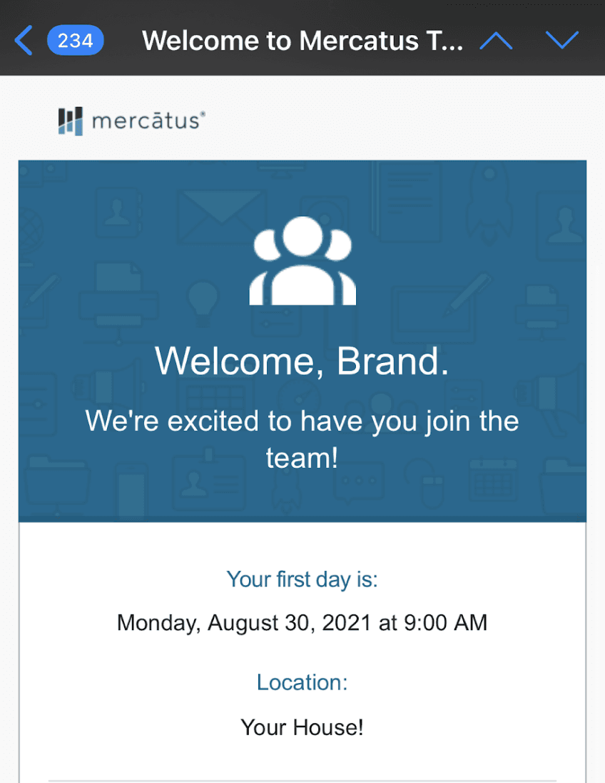
I joined the Mercatus product team as a UX designer, helped shape design strategy for improving the end-to-end shopping experience across our white-label web and mobile apps.
My responsibilities spanned defining the product direction, creating low- to high-fi designs and collaborating with product managers and developers to bring the features to life.
(I was thrilled to start this new chapter in my design career!)
As a white-label platform, Mercatus needed to strike a balance between system efficiency and brand individuality — a challenge that impacted both client onboarding and long-term product scalability. The challenge wasn’t building one product, but building many, with shared infrastructure but distinct needs.
To the Business
•
Most clients had similar brand colors (red or green), making storefronts visually indistinct
•
Each retailer integrated with slightly different APIs — the design needed to flexibly handle missing or partial data
•
High cart abandonment, bounce rate, and checkout drop-off pointed to deeper UX and performance issues
•
Low app store rating (2.1 stars) were impacting brand credibility
To the Customer
•
Inconsistency and outdated experiences across mobile and web
•
Friction in browsing, shopping and checkout flows
•
Performance issues impacted usability, especially with features like coupons, flyers, and sometimes even login
To the Design & Product Team
•
No shared design system across platforms led to inconsistent UI
•
Lack of documentation introduced QA debt and recurring bugs
•
Collaboration between design and engineering was fragmented
For a deeper dive into how we tackled these system challenges, check out my Design System case study.
We set on three clear goals based on the challenges.
•
Making the shopping experience easier and faster – Streamline product discovery, cart, and checkout flows to reduce friction, abandonment, and user frustration across web and mobile
•
Create design infrastructure to support the white–label business model — We needed scalable patterns and flexible theming so each retailer could reflect their unique brand identity
•
Work better across teams — Improve how designers and developers collaborate by creating reusable components, better documentation, and communication channels.
These goals helped shape the direction of the project – including building a brand new mobile app with React Native frame, redesigning key web flows like checkout, and establishing a new design system.
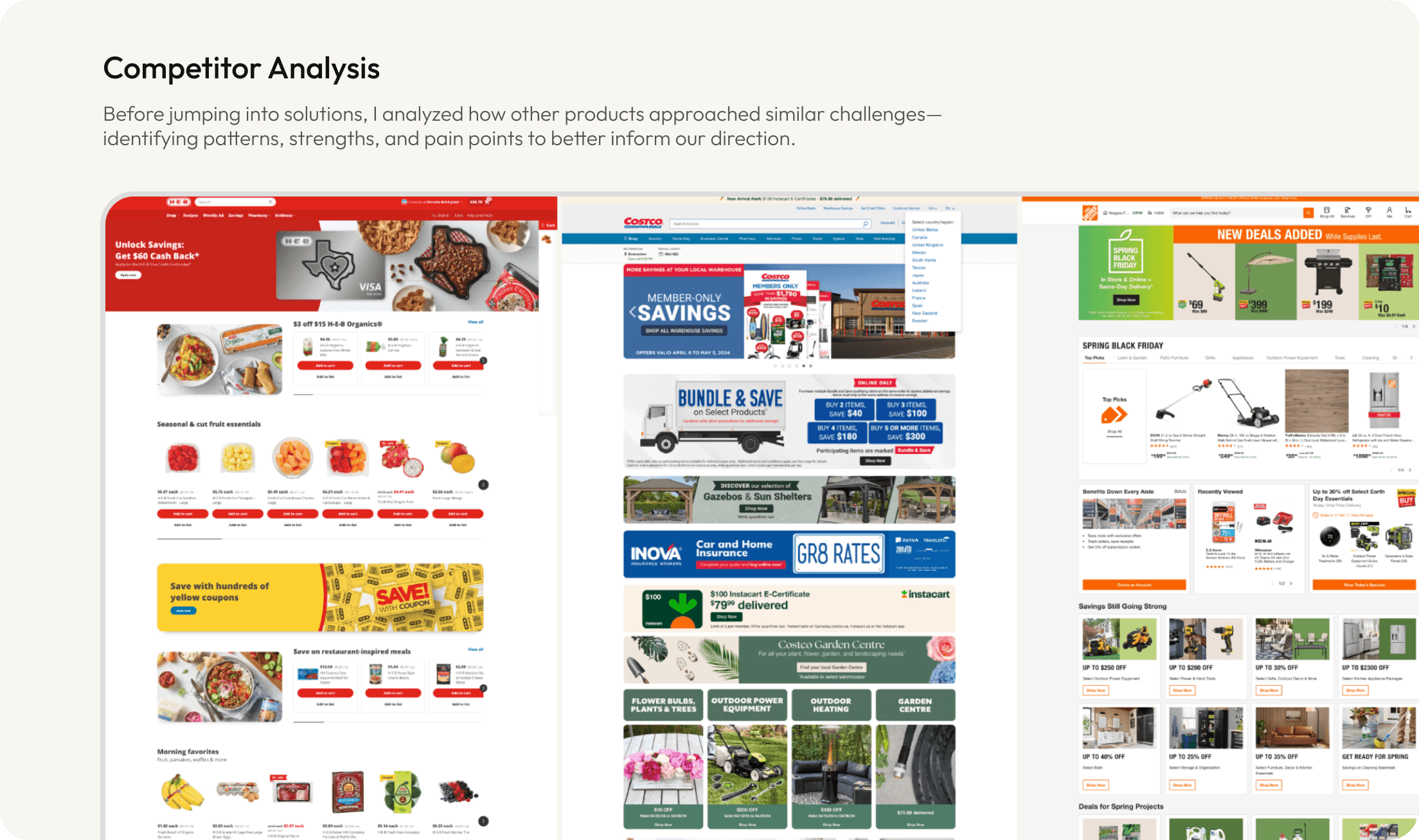
To better understand the problem space, I focused on both external benchmarking and internal signals:
•
Competitor Analysis – Studied how other white-label platforms structure their UX to support brand differentiation and consistency at scale
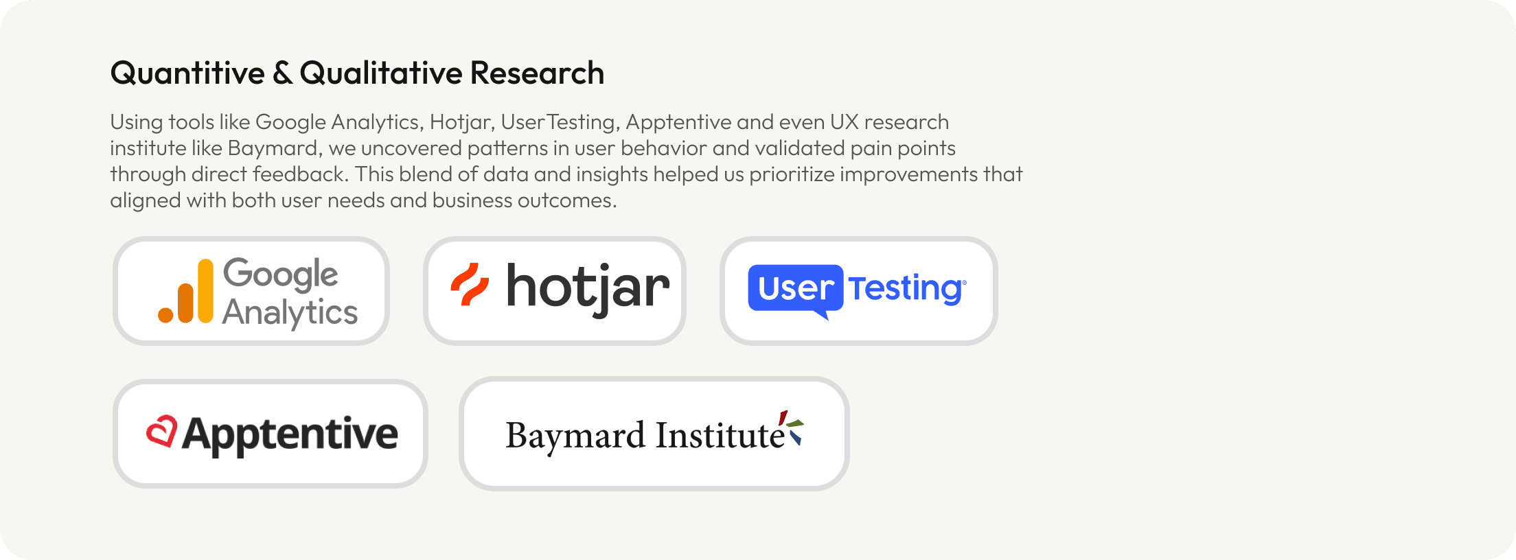
•
Google Analytics & HotJar — Investigated behavioral metrics like bounce rate and checkout abandonment to identify friction points in key flows
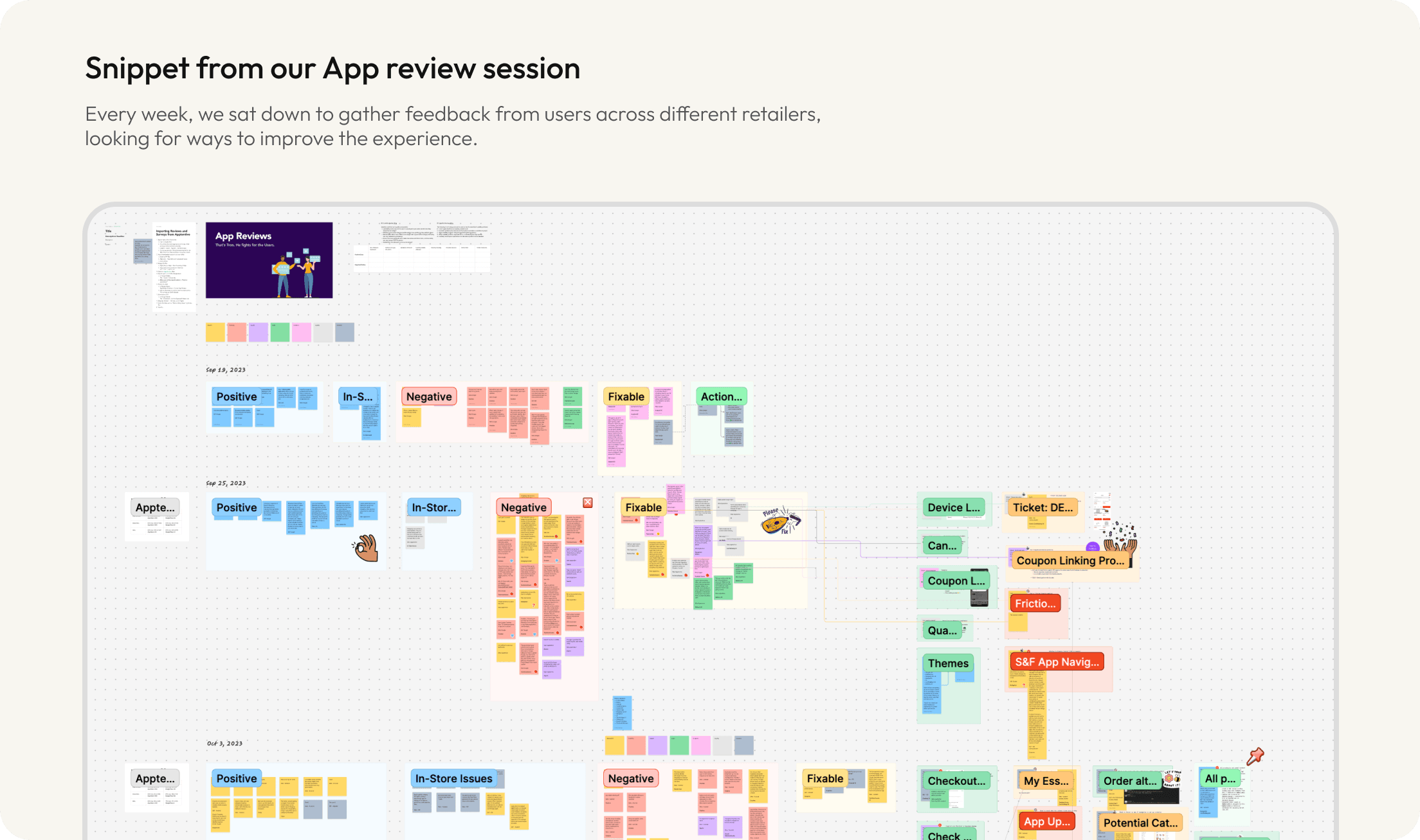
•
App Store Reviews & Support Tickets — Reviewed user feedback to identity recurring complaints and missed expectations
•
User Testing — Ran moderated tests via tools like UserTesting to validate flow improvements and collect feedback early before development
•
Baymard Institute — Referenced established UX best practices to evaluate our checkout and navigation flows against industry benchmarks
This combination of quantitative and qualitative research helped us frame the key problems and build empathy across the team.
Over three years, we gradually transformed a fragmented white-label experience into a more cohesive, scalable platform. Let me show you what this looked like.
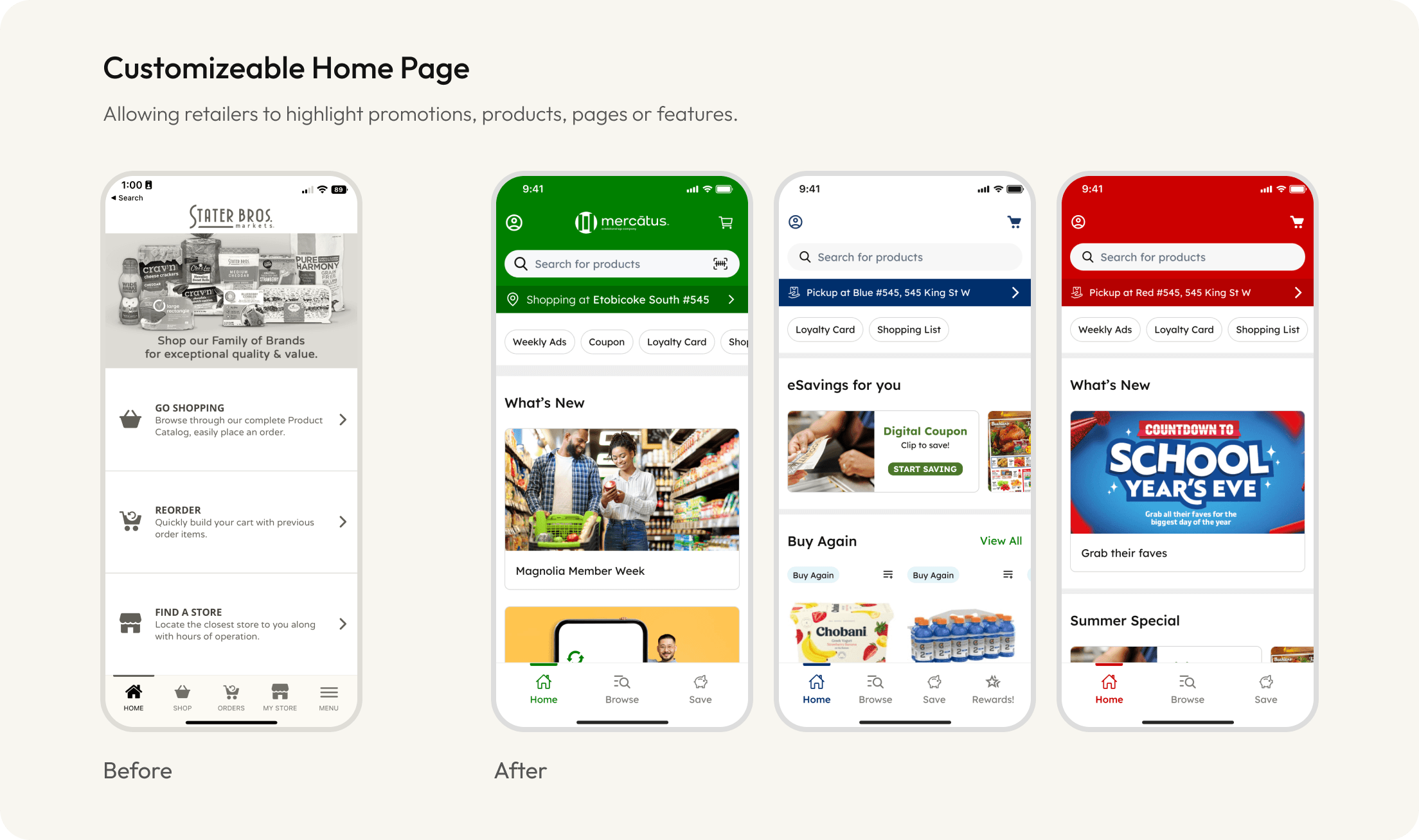
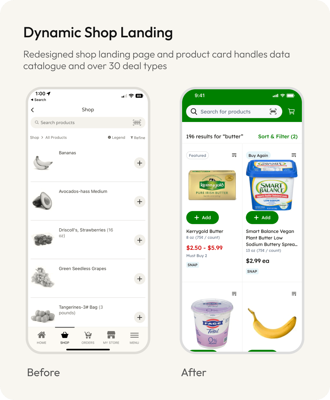
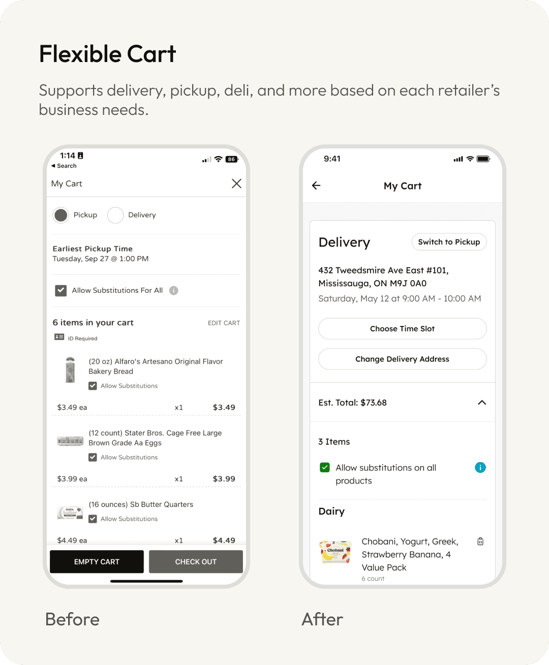
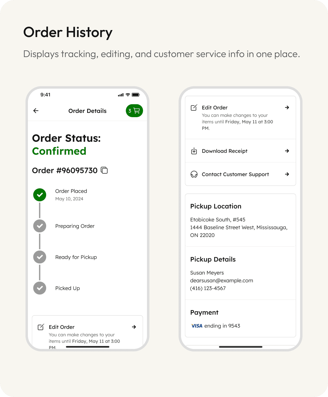
Redesigned Mobile App
We focused our efforts make the transition into the newly designed mobile app using React Native. The results were a significantly improvement over our legacy app. The new experience not only reflects the client’s brand identity, but also gives them more control back over their storefronts. The updated look and feel is modern, flexible and rooted in thoughtful UX.
Here are some of the metrics we were able to track:
4.6 Stars
Avg App Rating
from 2.1 stars previously
–24%
Checkout abandonment
rate across retailers
–19%
Cart abandonment
rate across retailers

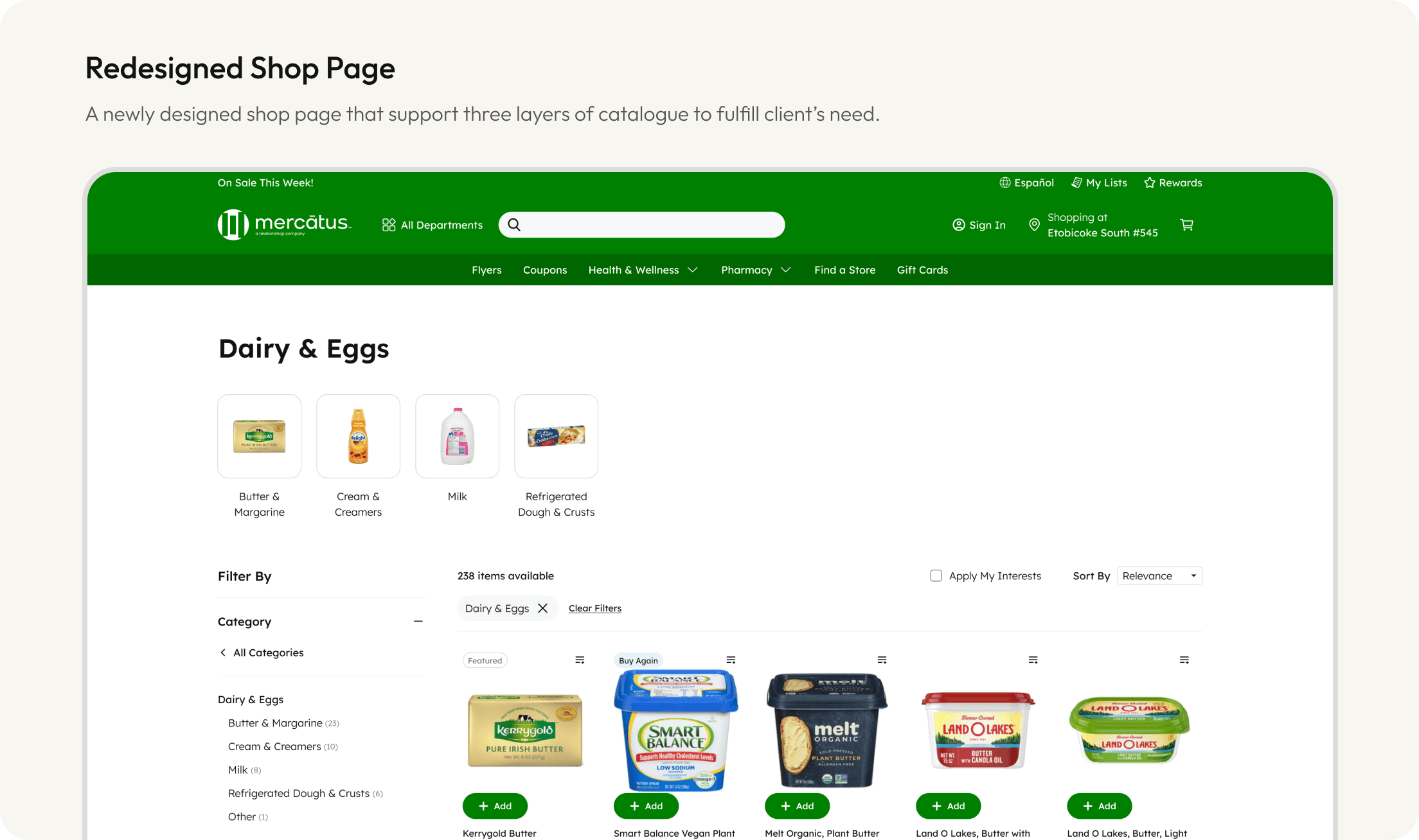
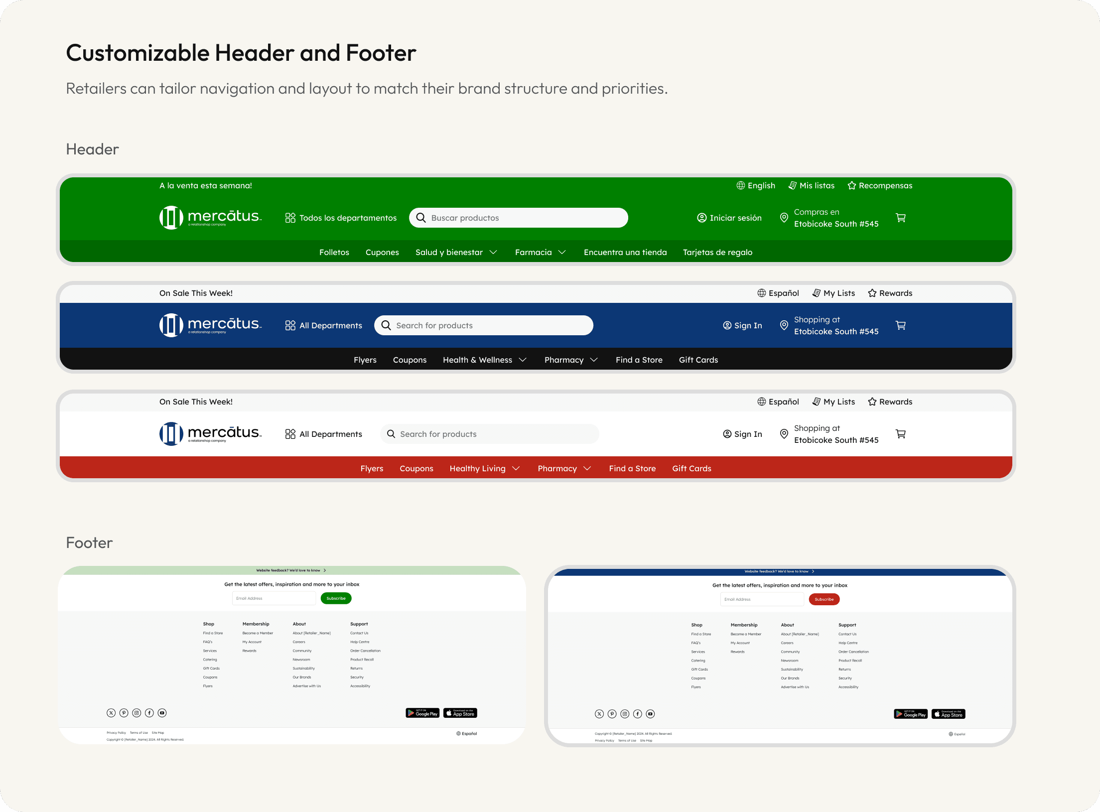
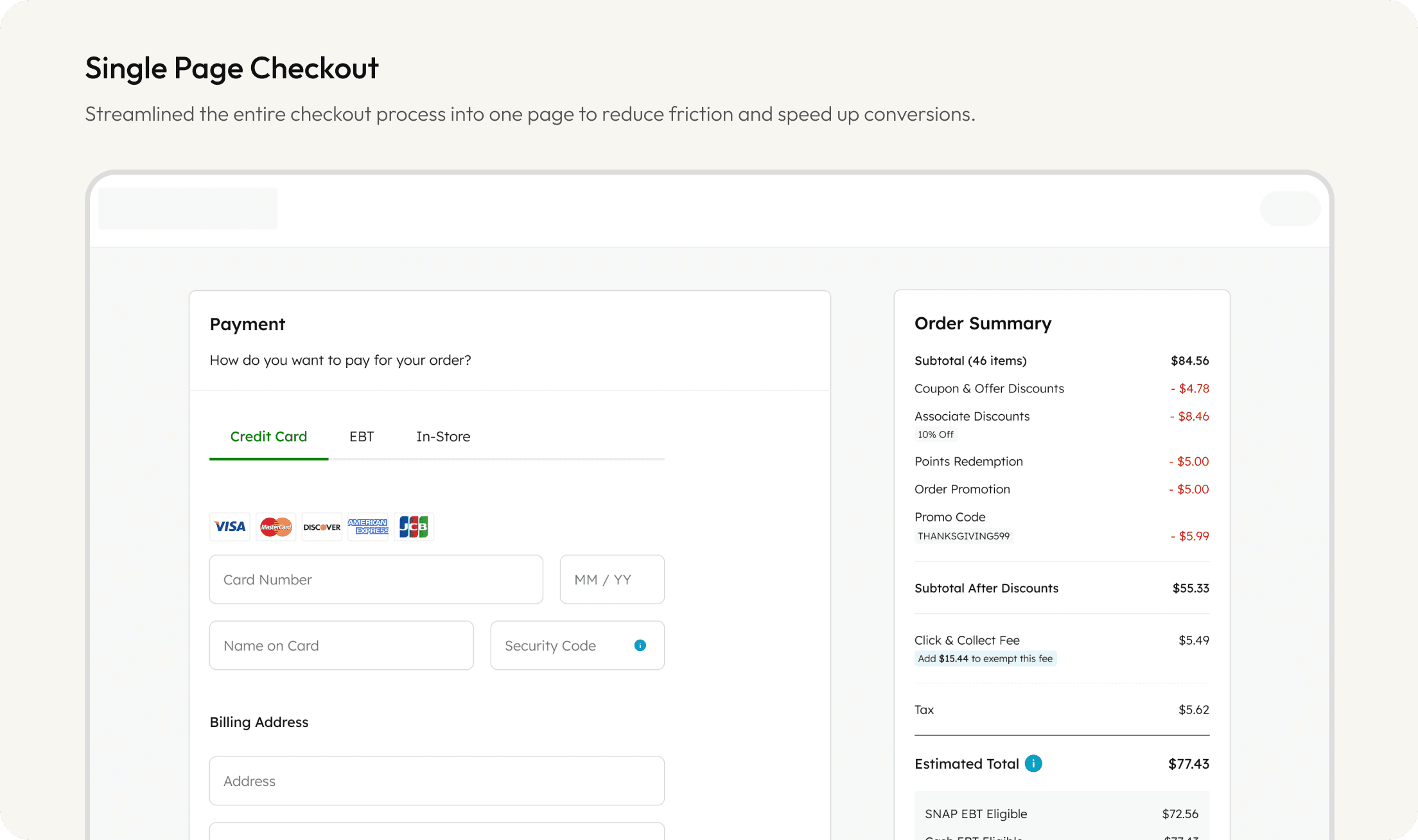
Refreshed Website Experience
Besides the mobile App, we also upgraded the website experience using our design philosophy. Previously, the Mobile and the Web were designed at different time and led to inconsistency results. Now it is the time to fix it and deliver a unified experience.
Here are some of the highlights:
The Collaboration
From requirements to final delivery, we focused on building a detailed handoff process. I worked closely with our Product managers and developers to ensure everyone is aligned.
•
Jira – A template was introduced to standardize the ticket to ensure no detail was missed.
•
Figma – We used the power of Dev mode to deliver precise, developer-ready design specs.
•
General Communication – Regular meetings and Slack messages kept everyone aligned while working remotely.
Looking back, working at Mercatus taught me the value of building scalable system with flexibility in mind. Designing for a white-label platform meant every decision had to account for variation, branding, and reusability, without compromising user experience.
At Mercatus, I had the chance to work with a great team. Together, we were able to push each other during every design critique session by constantly asking “Why”, which helped me grow as a better designer and make thoughful design decisions.
Next Project →
Design System
DesignToken
Mentorship
Est. 5 mins Read