Timeline
2022 – 2024
Platform
Figma
Mercatus is a white-label SaaS platform that powers digital storefronts for regional grocery retailers across North America. It offers a comprehensive suite of tools spanning eCommerce, loyalty programs, digital coupons, and last-mile fulfillment.
To support its scalable, multi-brand product offering, Mercatus introduced a centralized design system tailored to the needs of white-label grocery applications. The system established a unified visual language, reusable components, and implementation guidelines across both web and mobile platforms — enabling faster development and greater consistency across 15+ enterprise deployments.
As the lead designer responsible for creating and managing a design system, I had the opportunity to explore and improve the existing design infrastructure. This included auditing existing patterns, defining core components, and driving adoption across teams.
✨ Highlights
•
Lead designer in creating & managing a robust design system
•
Played a key role to the UX Guide. Provided documentation for established design rules
•
Integrated design tokens into the workflow
•
Ensured accessibility was prioritized when creating components
•
Mentored designers across the organization globally, empower them to create and maintain their own design systems
We encountered a few key challenges that made consistency and collaboration difficult across teams.
•
Inconsistent Design: Variations in font styles, colors, and layout led to fragmented user experiences
•
Non-Standardized Components: Similar components were built differently across teams, Even internally, the design system was hard to use and maintain.
•
Poor Documentation: Inconsistent or missing specs caused confusion during handoff, leading to mismatches between design and implementation.
We set on multiple clear goals based on the challenges.
•
Ensure Visual and UX Consistency – Unify the look, feel and behavior of UI elements across platforms, including the branded experience.
•
Increase Design and Development Efficiency — Don't reinvent the wheel. Reduce repetitive work by creating reusable components, styles, patterns, and clear documentations to speed up the handoff process.
•
Improve Scalability — Support the growth of Mercatus' white-label platform by designing a flexible system that can handle multiple brand identities while maintaining a unified core.
•
Support Accessibility and Best Practices — Bake accessibility, responsiveness, and usability into the system so every product meets a minimum quality bar by default.
Going over design files can be time-intensive, but it is a necessary first step before building any system.
I created a checklist to review key design element, including “typography”, “color”, “drop shadows”, “spacing” and more. This gave me a clear lens for identifying inconsistencies and gaps across files.
This audit reveals valuable insights about the current state of our design output and highlighted opportunities.

I held sessions to spoke with fellow designers and engineers to understand the flow and needs. It helps me identify the pain points and potentially surface best practices we could adopt moving forward.
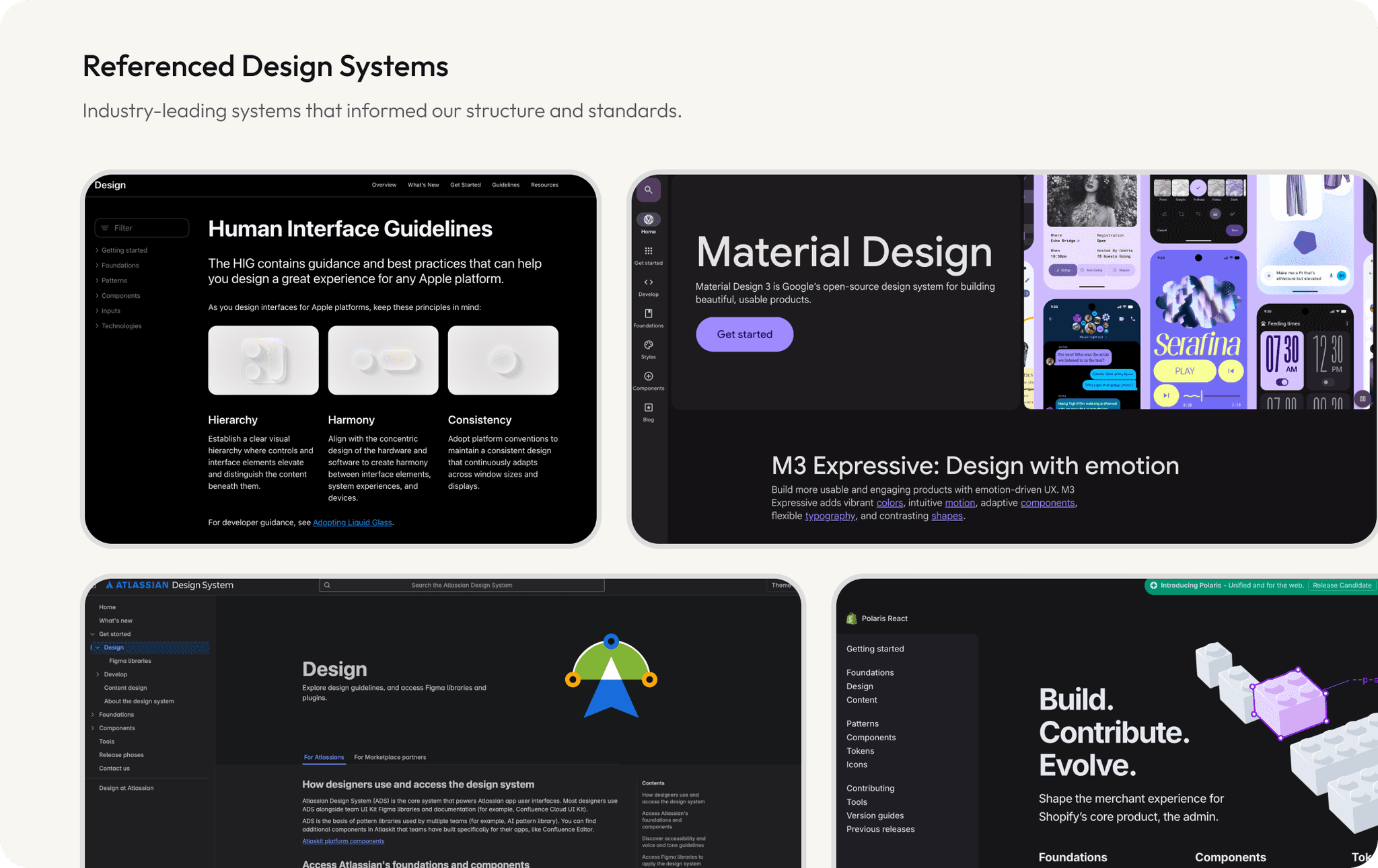
In parallel, I explored established design systems, including Shopify Polaris, Apple’s Human Interface Guidelines, Material Design, and Atlassian Design System to gather inspiration and best practices. This helped me benchmark our approach and identify patterns that could be adapted to our white-label context.
After the audit and research, I held regular check-ins with the design team to review findings and align on next steps. These sessions encouraged feedback and built shared ownership before moving into the build phase.
With team alignment in place, I began building the system’s foundations in Figma.
•
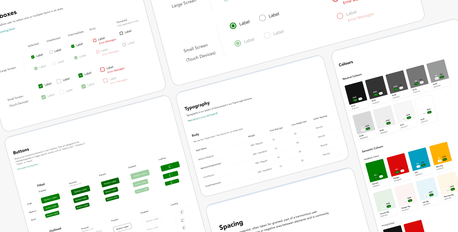
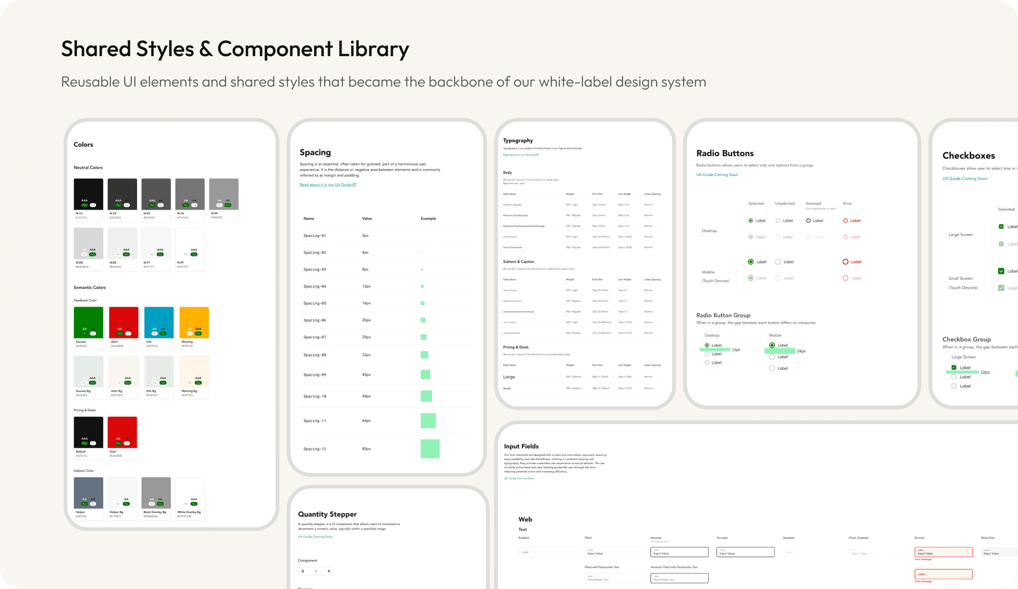
Component Library
I created a component library of reusable UI elements, from basic ones like buttons, form elements to complex patterns such as header & footer, modals and navigation. Everything was supported by the system of shared styles for typography, color, border and more.
•
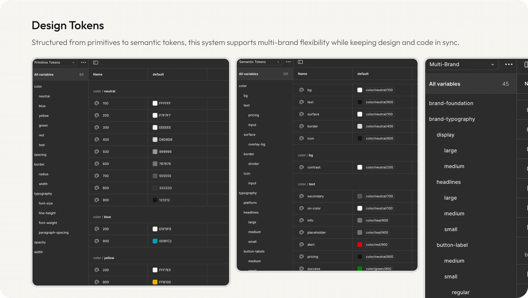
Design Tokens
For the first time, we introduced design tokens using Figma’s native variables — defining color, typography, spacing, and elevation values. This not only improved consistency but also helped bridge the gap between design and code, especially as we scaled across white-label brands.
•
Documentation & Handoff
To ensure consistency across the organization, we created a UX Guide that served as a central reference for the entire team. The Design System was structured into three clear categories: Foundations, Components, and UX Patterns.
The goal was simple — to make UX rules visible, accessible, and easy to follow. Even as a small team, we committed to updating the guide weekly to keep it current and aligned with ongoing product changes.

•
Glossary
It’s funny how the same thing can go by so many names — is it “Pickup” or “Pick Up”? “Checkout” or “Check Out”? Unlike elephants, we tend to forget. So this became the perfect opportunity to standardize the vernacular within the organization.
To solve this, we created a dedicated Glossary page. It didn’t just capture general terminology — we organized all terms into categories like Shopping Feature, UI Element, User Type, UX Concept, and Workflow to make them easier to find, reference, and adopt across teams.


•
Adoption
To kick off adoption, I updated recently handed-off design files to align with the new system standards — ensuring immediate consistency in ongoing work. Since our team didn’t have a dedicated design engineer, I proactively set up regular syncs with developers to stay aligned.
These sessions helped us refine naming conventions, structure components collaboratively, and ensure a smoother handoff between design and code. Through continuous communication and shared ownership, we began to see real improvements in consistency and cross-functional understanding.
The introduction of the design system brought immediately clarity and alignment to our product workflow. Designers began working more efficiently with a shared library and consistent styles, while engineers benefited from clearer specs and better naming conventions.
Although our team was small, the system scaled quickly — being used across multiple brand rollouts and ongoing product updates. The glossary reduced confusion around terminology, and the documentation became a trusted reference for both design and product teams.
Expanding the System Globally 🌎
After Mercatus was acquired. our design team became part of a larger, global organization. As the first team to launch a fully working design system, we were tasked with sharing our knowledge across new regions.
I led this effort by setting up onboarding meetings, creating a follow-up schedule, and connecting weekly with designers to help them understand how to use and maintain the system effectively.
It was an learning opportunity for me to mentor other designers by showing them the real power of design systems and how we manage it through Figma.
Design Systems are Always Evolving
A design system is never static — it’s a living product that constantly evolves. That’s why I stay up to date with the latest trends, Figma updates, and best practices to continuously improve it. This mindset not only benefits the team I work with, but also drives long-term value for the business.
“Brand is an exceptional UI/UX designer with a strong curiosity for user needs and a clear expertise in tokenization and design systems. His dedication and progress earned him the affectionate nickname "Master Librarian."
– Michelle MacMillan, UX Designer @Mercatus
Next Project →

SaaS
Startup
Design System
Est. 4 mins Read